Color Theories Introduction
When you're decorating, choosing a color scheme can be a perplexing task. It's hard enough whittling down your choice to one or two colors — but then to have to mix and match even more of them into an eye-pleasing scheme? Sometimes considering the whole color wheel is just too much to ask.
Before you turn back on the world of color, get a grasp of the color wheel and how it works.
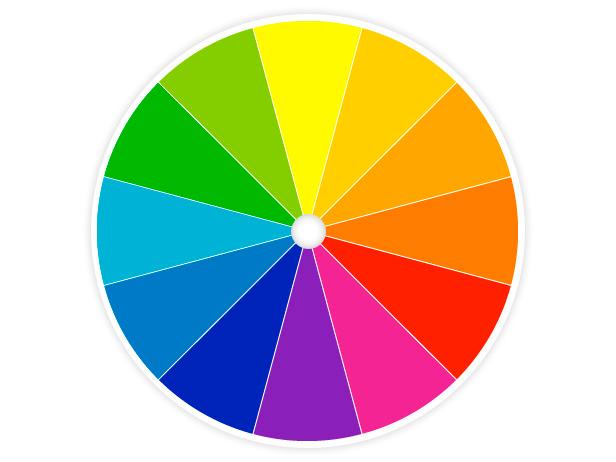
In 1666, Sir Isaac Newton performed a prism experiment in which he discovered that pure white light contains the full spectrum of colors — in effect, creating the world’s first color wheel. From there, philosophers, scientists, artists and designers have continued studying the components of color and its physical, psychological and philosophical effects.
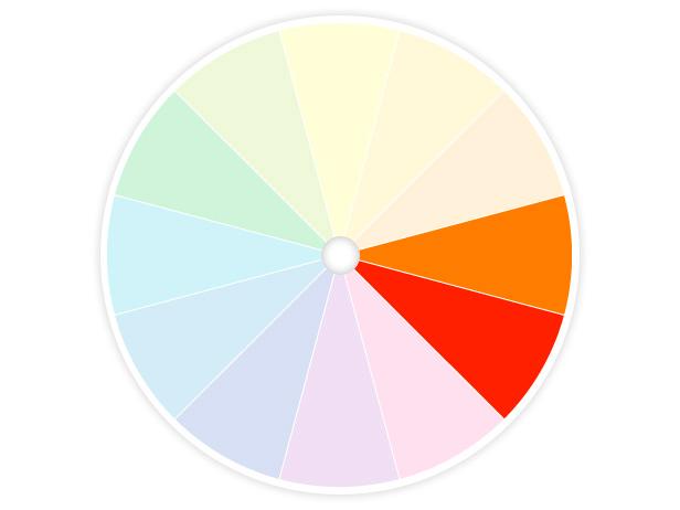
Newton's wheel is made up of 12 colors, which are classified into three categories:
Primary Colors: Red, Yellow and Blue
Secondary Colors: Orange, Green and Violet
Secondary colors are created by mixing primary colors.
Tertiary colors are a combination of a secondary color and a primary color next to it. They include yellow-orange, red-orange, red-violet, blue-violet, blue-green and yellow-green.
Now that you know the colors here are four common ways to use them in your home.
One Color — Monochromatic
Take baby-steps toward color with a monochromatic scheme. It's simply one color in varying intensities from light to dark.
Two to Six Colors — Analogous
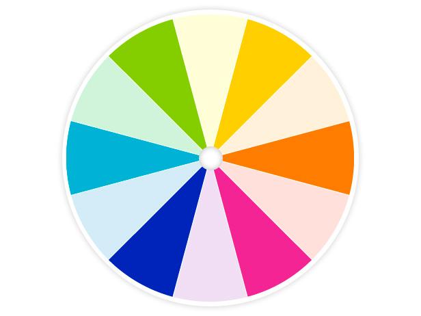
Branch out into color with an analogous scheme, which consists of two to six colors that sit next to each other on the wheel.
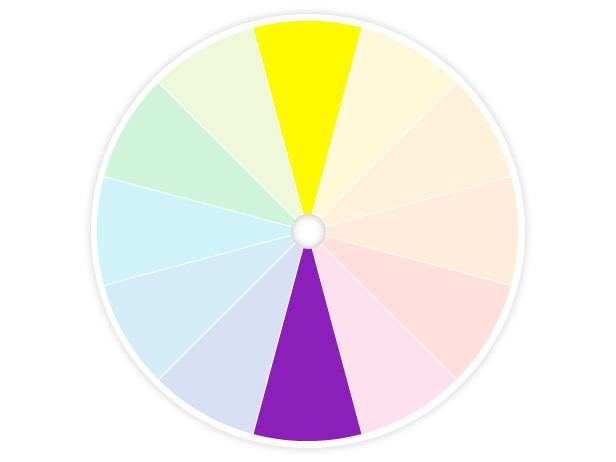
Two Colors — Complementary
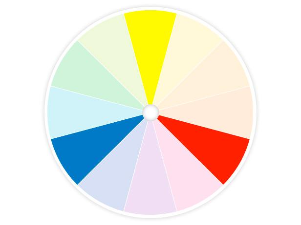
Want to go for high-contrast color? Use a complementary scheme — it includes hues that are directly across from each other on the wheel.
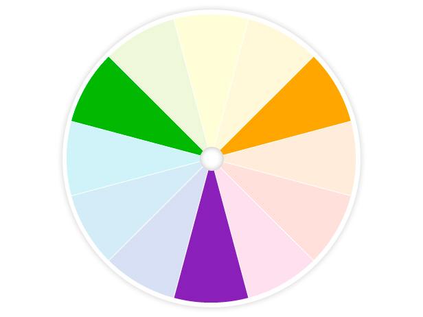
A triad scheme is bold but more importantly, it's balanced. It's made up of any three colors that form a triangle in the center of the wheel.
In addition to understanding how colors work together, it's also helpful to know the three dimensions of the colors on the wheel.
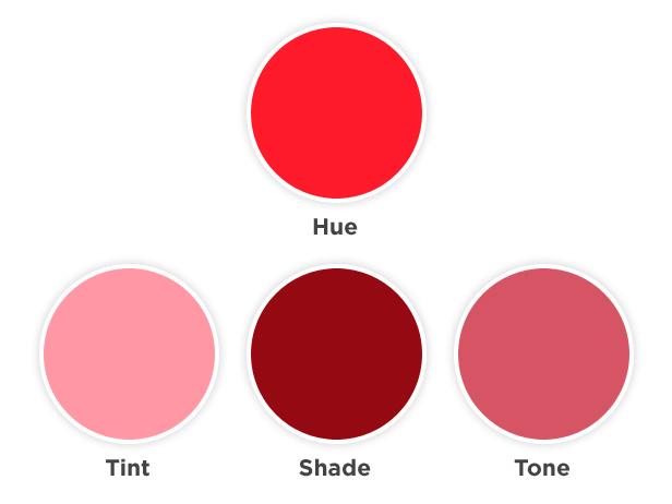
Hue is commonly used interchangeably with the word color but technically refers to the pure spectrum colors in the color wheel.
The value of a hue is determined by adding white to create a tint, black to create a shade or gray to create a tone.
Saturation is the purity of the hue. The colors on the wheel are considered to be in their purest form. As the colors move towards the center, as shown in the graphic at right, they are considered desaturated where no hue dominates.
Natural Reactions to Color
Do you shiver when you’re in a light blue space? Fan yourself in a room full of red? Don’t worry — there’s a scientific reason why. Colors are indelibly tied to natural elements like fire, water, sky, evoking certain responses just as if you were seeing and experiencing it firsthand.
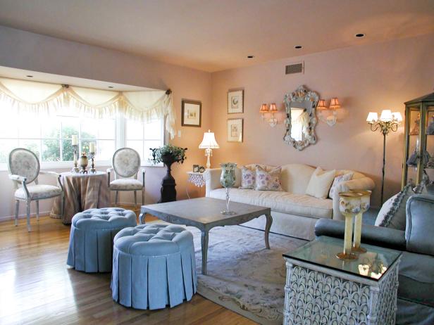
Cool colors like blue and green do just that — cool and soothe your mind, body and spirit. It's no wonder we flock to the ocean and mountains to rejuvenate our senses. These hues are best used in rooms where you want serenity to prevail.
If cool colors make you geel good, check out these refreshing rooms for decorating inspiration:
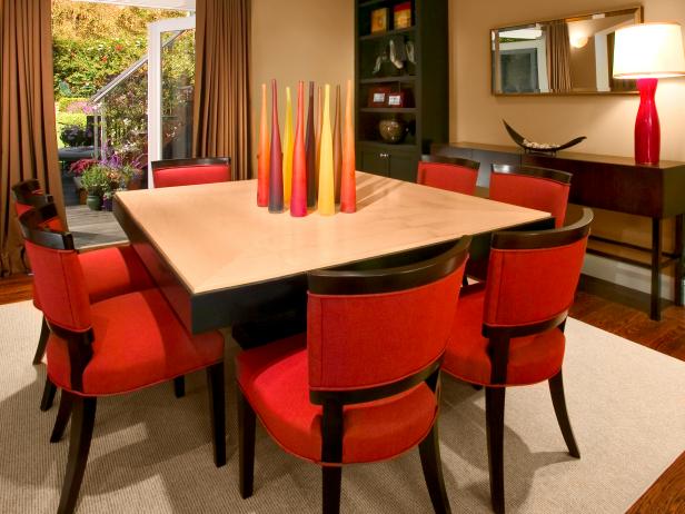
Warm colors like red, orange and yellow give off an energy and intensity unmatched by their cooler cousins. Use these hues in rooms where you anticipate (and want) activity and stimulation, like a kitchen, child’s playroom or exercise space.
